This magazine is called Vibe and is targeted at people who are interested in urban and R&B music and is published by Vibe Media. The central image is of a well known artist which makes you instantly know that he is the main story in the magazine. Also as there are no other images on the page suggests that it is also very important. The man in the picture seems very confident and relaxed which makes the readers want to read about him and find out what he’s about. The masthead is in the background of the magazine showing that it is not the most important thing on the magazine. It is also in very bold and large in the top of the magazine which makes it stand out. There are different cover lines with different size fonts which show that some are more important than others. There are different colour fonts but the two main ones seem to be blue and yellow which stands out. Also the different colours help brighten up the magazine and help make it stand out.
This music magazine is called Q and is published by Bauer Media Group. There target audience is people age of 17- 27. The masthead is in the top right corner of the front cover in the background. The central image is the only image on the front cover which shows that it is important and has an important story. The image contains a very popular well known group which would help attract readers. The front cover contains a puff which would draw readers in to buy the magazine so that they would get the free item. There are a few coverlines but the main one is in the middle of the front cover in bold to attract the readers to buy the magazine. The main colours on the front cover are red and white which complement each other and go well with each other which attract readers.
This is a contents page from Q magazine. There is one main image on the right side of the page of the band that is the main feature of the magazine. There is a magazine review of what is in the magazine under the picture. The main features are listed down the side of the magazine with a short explanation of what each feature includes and the page number. In the bottom left corner there is a small list of features that occur in every issue. There is a banner at the top of the page with the name of the magazine and page and date of the issue. The colour scheme is simple with just red, black and white which links to it target audience.
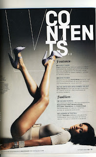
This is a contents page from vibe magazine. There is a main image which is the background and fills most of the page. The title of the page is split into three lines which looks unique and cool. The features are down the right side of the page which a short explanation under each title. The fonts are mostly the same but there are some different colours and some parts are bold.
This is a double page spread by NME. There is an image of the main person that they are interviewing and featuring. He is on the left side of the page spread filling the whole page. The right page has an interview with him and some information about him to get the readers interested. There are some smaller images between the text to break it down. The colour scheme is simple and connects with the theme of the magazine with blue and cream colours. The main title for the double page spread it bold and not very serious but stands out.
This is a double page spread from Flavour magazine. There is again a main picture of the artist being interviewed on the right page which shows that the double page spread is about her and her success. There is also a smaller image on the left page which helps break the text up and stops it from looking to busy. The background is plain white which makes it look sophisticated. The font is mainly black apart from a little bit which is pink which highlights a quote.


No comments:
Post a Comment