
Monday, 30 January 2012
Research and Planning: Initial Idea For Music Magazine
The sub-genre that I am going to choose to produce for my music magazine is R&B/ Hip Hop. The age range i have chosen is from 17-24. The gender that I will be targeting is male and female. The magazine that I could use to compare to are Vibe magazine. the artists that I could include in the magazine are drake, Rihanna, Rizzle kicks and Jay Z.
Sunday, 29 January 2012
Tuesday, 24 January 2012
Questionairre
1. Do you read music magazines often?·
- Yes
- No
- Sometimes
2. Which name do you think is most appropriate for my music magazine?
- Urban Edge
- Urban Burst
- Chilled Edge
- Cool Blast
- £2.50
- £2.99
- £3.50
- £3.99
4. Which colours would you prefer for the music magazine?
· Black, Red, White
· Black, Purple, Blue
· Red, Orange
· Green, Blue, White
5. Which content would you prefer to see in the magazine? Tick more than one.
· Interviews with artists
· Interviews with producers
· Album reviews
· Artist reviews
· The official chart
· Gossip
· Gigs
· Competitions
6. How many magazines do you read a month?
- 1
- 2
- 3
- 4
- 5
7. How would you prefer to read the magazine?
- In hand
- Online
8. How often do you think they should be published?- Once a month
- Three times a month
- Once every six months
9. How many pages should the magazines contain?- 60
- 75
- 100
- 125
- 150
10. What kind of adverts would you like to see in the magazine?- Clothes
- Films
- Games
- Music
- Food
- Phones
My Questionnaire
Here is a link to survey monkey for my questionnaire: http://www.surveymonkey.com/s/XPKSHJ3
Wednesday, 18 January 2012
Montage of different magazines

This montage shows that there is a wide range of music magazines sold in the UK with different genres of music which can target different audiences.
Monday, 16 January 2012
Research and Planning- 3 X analysis of Front cover, 2 X analysis of Contents page and 2 X analysis of Double page spread

This magazine is called Vibe and is targeted at people who are interested in urban and R&B music and is published by Vibe Media. The central image is of a well known artist which makes you instantly know that he is the main story in the magazine. Also as there are no other images on the page suggests that it is also very important. The man in the picture seems very confident and relaxed which makes the readers want to read about him and find out what he’s about. The masthead is in the background of the magazine showing that it is not the most important thing on the magazine. It is also in very bold and large in the top of the magazine which makes it stand out. There are different cover lines with different size fonts which show that some are more important than others. There are different colour fonts but the two main ones seem to be blue and yellow which stands out. Also the different colours help brighten up the magazine and help make it stand out.


This music magazine is called Q and is published by Bauer Media Group. There target audience is people age of 17- 27. The masthead is in the top right corner of the front cover in the background. The central image is the only image on the front cover which shows that it is important and has an important story. The image contains a very popular well known group which would help attract readers. The front cover contains a puff which would draw readers in to buy the magazine so that they would get the free item. There are a few coverlines but the main one is in the middle of the front cover in bold to attract the readers to buy the magazine. The main colours on the front cover are red and white which complement each other and go well with each other which attract readers.

This is a contents page from Q magazine. There is one main image on the right side of the page of the band that is the main feature of the magazine. There is a magazine review of what is in the magazine under the picture. The main features are listed down the side of the magazine with a short explanation of what each feature includes and the page number. In the bottom left corner there is a small list of features that occur in every issue. There is a banner at the top of the page with the name of the magazine and page and date of the issue. The colour scheme is simple with just red, black and white which links to it target audience.

This is a contents page from vibe magazine. There is a main image which is the background and fills most of the page. The title of the page is split into three lines which looks unique and cool. The features are down the right side of the page which a short explanation under each title. The fonts are mostly the same but there are some different colours and some parts are bold.

This is a double page spread by NME. There is an image of the main person that they are interviewing and featuring. He is on the left side of the page spread filling the whole page. The right page has an interview with him and some information about him to get the readers interested. There are some smaller images between the text to break it down. The colour scheme is simple and connects with the theme of the magazine with blue and cream colours. The main title for the double page spread it bold and not very serious but stands out.

This is a double page spread from Flavour magazine. There is again a main picture of the artist being interviewed on the right page which shows that the double page spread is about her and her success. There is also a smaller image on the left page which helps break the text up and stops it from looking to busy. The background is plain white which makes it look sophisticated. The font is mainly black apart from a little bit which is pink which highlights a quote.
Research and planning: Magazines and Institutions
NME
The company who publish the NME magazine is called IPC Media. IPC Media produces over 60 magazine brands. The some of the different magazines targeted at male audiences include Country Life, horse & Hound, Rugby World and Decanter. Women’s magazines contain Look, Chat, Now and Woman.

There produce a wide range of genres from Horses to biking to TV. IPC Media produce only two music magazines NME and Uncut.

Introducing Main Task
Now that I have completed the prelim task, I am going to begin to research and plan for the main task which is to produce a front cover, contents page and a double page spread for a music magazine.
Action Plan
Action Plan
16th Jan:
- Compare Magazines & research the magazine market place
- Research similar products: 3X front covers, 2X contents page, 2X double page spread
24th Jan:
- Initial ideas
- Audience research
- Writing treatment plan
30th Jan:
- Layout/ Masthead ideas
- Plan photoshoot and take photos
- Drafting of pages
- Audience feedback
6th- 27th Feb
- Drafting of pages
- Audience feedback
5th March:
- Evaluation
16th March:
- Final Deadline


Results to questionnaire
What is the most appropriate name for a college magazine?


 |
| How much do you think it should cost? |

What language do you think is most appropriate?

What topics do you want in this magazine?

How often do you want it?

What colours do you think would be most appropriate?

Do you want it in hand or online?

What pictures would you prefer to see in this magazine?

Questionnaire
1. What name is most appropriate for the college magazine?
· College 101
· Student 101
· ChitChat
2. How much do you think it should cost?
· Free
· 20p
· 50p
· £1
3. Which language do you think is most appropriate?
· Formal
· Informal
4. What topics do want in the magazine?
· College events
· Local events
· Celebrities
· Music and film reviews
· Fashion
5. What colours do you think would be most appropriate?
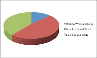
· Orange, white and black
· Blue and purple and white
· Blue, red and white
6. How often do you want it?
· Weekly
· Monthly
· Every 3 months
7. Do you want it online or in hand?
· Online
· In hand
8. What pictures would you prefer to see in the magazine?
· Students
· College area
· Ludlow
Wednesday, 11 January 2012

This magazine is targeted at students who go to university. The masthead is bold and white, which is very eye catching. Also it is in the background, which connotes that the contents are more important. The title is called ‘CAMPUS LIFE’ which connotes that is covers a lot of topics and targets all genres. The central image is very large and fills the whole page with no other images on the cover. It also overlaps the masthead to show importance. A puff is included to give students an opportunity to win a 8GB Zune that most students may not be able to afford. Also there are cover lines, which vary different topics to interest different people.

The contents in this magazine have a selection of images to show the different topics included in the magazine. Also it is quite formal and grown up by the use of fonts and colours of black and red. The contents show that the magazine has been split into different sections, which could interest different people. They also call the contents page ‘Table of Contents’ which is different and fresh from other magazines.

247. Is a student magazine targeted at university students. The masthead is in the top right corner and has a different font to the other writing on the page, which helps make it stand out. Also is it white and bold on a green background, which also helps it stand out. The magazine is called 247. Which connotes that it doesn’t have a target genre. The central image is very large and fills the whole page. The background is very colourful which could connote student life. It also helps to magazine to be very eye catching. The cover lines are organized on the right bottom corner of the page which makes them easy to read and so that its not to busy.

The contents page has one main image in the middle of the page, which is artwork. This helps the page seem calm and doesn’t make it too busy. It also includes information to get in contact with the magazine company. There is also a section at the bottom called the ‘Editors Letter’ where the editor sums up the magazine and persuades the readers to read the whole magazine not just certain sections. The contents page is split in to different sections so the readers can easily find what they want to read. The background is orange, which relates to the image and helps the entire information stand out which is in white.
Subscribe to:
Comments (Atom)